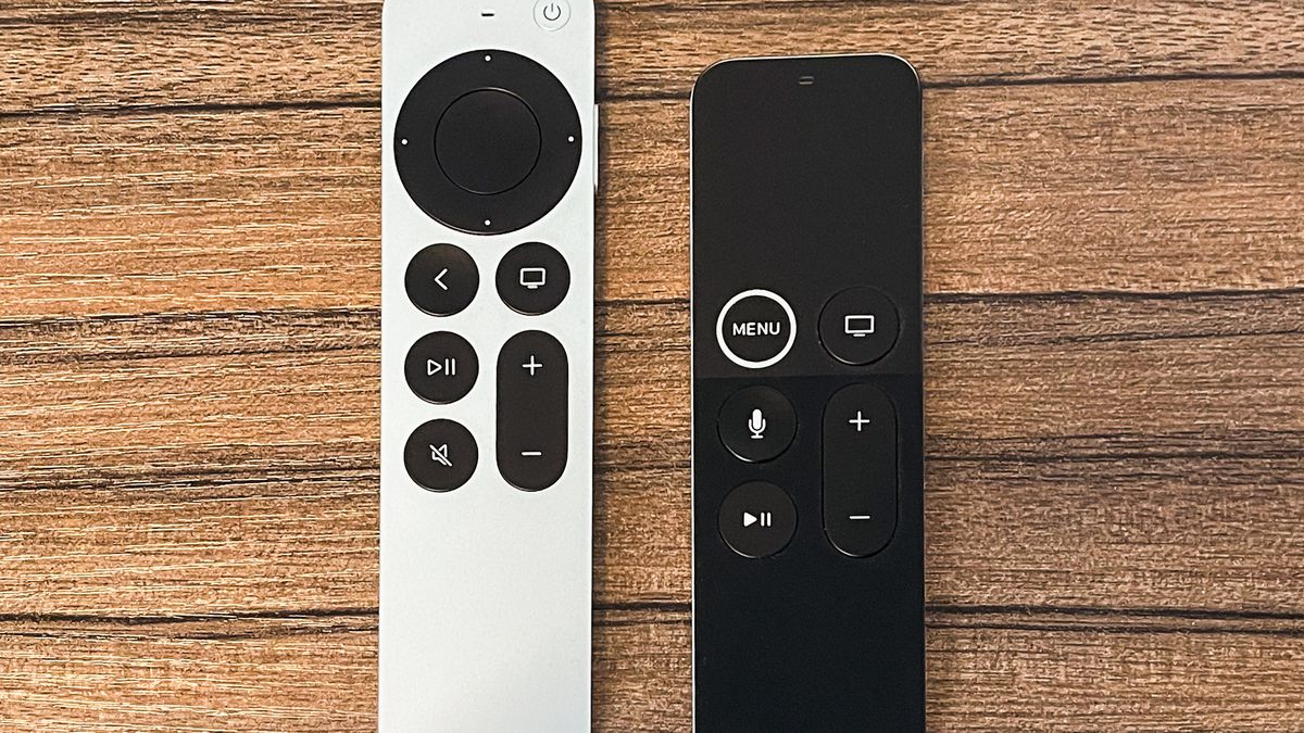
I have been an Apple TV user for the last 7 years. And I absolutely love the little black box. However, I hate the remote. For a company that consistently designs fantastic UI and physical products - the black Siri apple remote is a horrendous design. Just use it for a few minutes and its obvious whats wrong with it:
- It’s easy to pick up backwards because the buttons are centered.
- It’s easy to click the trackpad inadvertently - because you picked it up backwards.
- The bottom is a smudge magnet - and quite frankly disgusting looking after a few hours of use
- It’s black - how are you supposed to know what you are clicking in the dark?
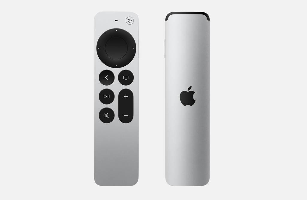
You have to wonder how it ever made it out of the prototype stage like this. The new aluminum Siri remote fixes every single one of these problems. Just look at it:

This alone justifies upgrading to the new 5th generation Apple TV. You have to wonder what the hell took six years to fix this mess.