The art of mechanical watches has always fascinated me. Sure, they are yesterday’s technology. A $23 Casio calculator watch will run circles around something like an A. Lange & Söhne Grand Lange 1 watch when it comes to accuracy, functionality, durability and affordability.
But what a fine mechanical watch offers is a statement of precision and art. Case in point is the extreme attention to detail placed in the typography of these watches.
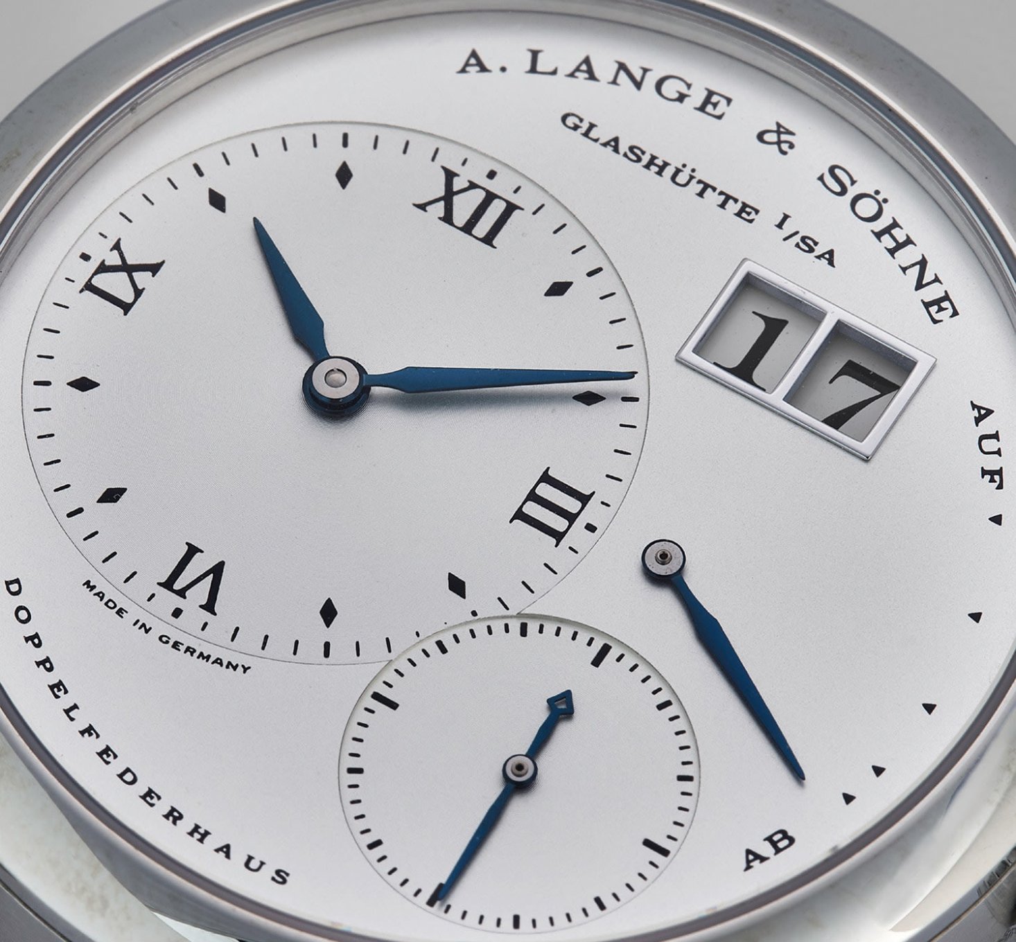
Good typography should be almost unnoticeable. Blending seamlessly into the rest of the design, it should tell you everything you need to know, without you being aware of it. Despite the many restrictions that are applied to dial layout, the creativity that can be seen in typography across horology is quite staggering. To put it simply, typography is the art and technique of arranging type to make written language legible and appealing when displayed. As the dial is the main point of interaction with a watch, it is arguably one of its most important parts, and certainly one that can produce the most emotion. This is why typeface can play such a vital, yet subtle, role in how we experience and feel about a certain piece.
If the $130,000 price premium of a A. Lange & Söhne Grand Lange 1 is worth it to you - well thats another discussion all altogether.